Tuesday 14 December 2010

Images sent to Farnell's for print.

These are the images that I have sent to Farnell's Photographic Lab. I have included the images I took of the piece in situte, as I feel it has to be seen this way as my work was a installation.
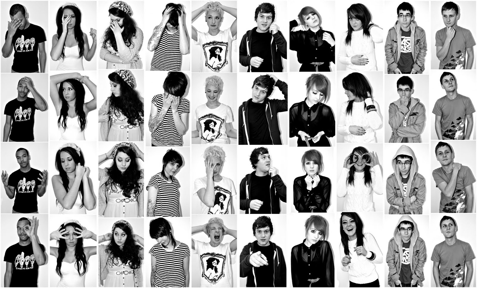
The montage of the photo booth strips will be in my portfolio as it was in the exhibition as it is printed on 5mm foam board and I dont see the point in having it reprinted. The portraits I have chosen are purely based on aesthetic favourites.
With regards to the 35mm portraits that were set up with the same lighting as the screen test, I think Thoms and Lucys are the strongest. Their connection to me with their eyes is strong and I felt this connection during the shoot. I have also singled out portraits from the photo booth montage. I really felt I needed these printed as they worked standing alone. Again this was based on the strength of pose, the gestures both leanne and Thom performed without direction really captured a strong look.


Costs for the 6 12x16 Lustre prints from Farnells will be :
£7.30 x 6 = £43.80 + VAT.


My exhibition piece documented for portfolio.

These are my favourite pictures of my installation in situte. They were taken on the opening night and the day after. I will chose later on which ones I would like printed or whether to have them all printed.


Opening night 13th of December 2010 @ The New Britannia Inn.

These image were taken for me by a friend whilst I interacted with the people who camer to view. It was a real success and at one point the room was full with about 50 people. The only disappointment was I had arranged for the LEP to arrive between at 7:30pm and they cancelled due to a breaking story. It would have been great timing if they could have come as it got busy at that exact time. It was really good to see peoples reactions to your work and discussing how and why with them. One person said that when he watched the screen tests he found himself copying what they were doing. The whole event was so exciting and stressful at the same time and in a way passed me by quite quickly. Though saying this I would definately do it again.


Exhibition Displays.

I took it upon myself to take pictures of all our pieces in situte. I did this before the opening and the next day. On the tuesday after the exhibition Steve Speed came to have a look, as I had invited him so that we could get his feedback. He said that he thought we had curated the exhibition really well and then he went round each piece and discussed the pro's and where we could develope techincally and as a production for next semester.


Sunday 12 December 2010

Constructing the exhibition day.

Today all three of us arrived at the Britannia to hang our work and for me construct the scene for my work. Throughout the day we had to nip in and out to grab stuff. For example the light shades in the room were blue and it was creating a dim look to the room. So I went and purchased two cream paper lighshades, this then gave the room a brighter yet cosy look.
There was also still stuff that belonged to a band and the landlord in the room we were using so myself and a friend moved this upstairs.
One major problem I came across today was that the tv I had borrowed from stores. When I played the dvd of the screen tests the colouring was awful. It had green and yellow tones to the models skin tone. I have decided to bring my own lcd tv in tomorrow as I know that it works on it and it will also look better as a whole. I do feel a little stressed as I hope that I can carry and transport the lcd without breaking it. Apart from the tv I have hung my frames and placed the photobooth montage on a music stand. Also I will arrange the other frames and ornaments tomorrow as I am borrowing a coffee table from Lewis and Nathan.
Once this is all done tomorrow I hopefully will feel more relaxed and enjoy the exhibition.

Tuesday 7 December 2010

Name & Title of my piece.

This is what I have designed to have placed alongside my work. I've kept the title simple very much like Warhol did with his tiltles. I added the Warhol quote as I see it as relevant to the man himself and my exhibition piece. I designed this at home and I have printed a copy on satin photo paper.


I think it is only right to thank the people involved. Hussain the videographer and the models. I will print this off and place in a second hand frame that I have customised with a shabby chic coloured green paint. The frame isn't very big, though I think that text shouldn't be in a large frame as I don't wish it to distract from my other frames.

Monday 6 December 2010

Post Production Costs.

Frames
x 10, various sizes ( new and second hand ).
= £38

Paints ( customising frames )
x 5
£7.50

Push Processing and Scanning.
35mm film x2
= £24

Exhibition Prints.
x10
3 (6x4)
6 (8x6)
1 (12x8)
1 (20x16 -5mm foam board)
= £ 28.65

Total = £98.15

Final Images for the exhibition

Lucy - 35mm film
Leanne - 35mm film


Harriet - 35mm film

Nik - 35mm film

Jess - 35mm film

Tash - 35mm film

Thom - 35mm film

Tyson - 35mm film

Andy - 35mm film

Roxy - Nikon D300 Digital


Photo Booth Montage - Nikon D300 Digital


Sunday 5 December 2010

Image Titles.

As each of my images is a document of a different city, I feel that I should title each individual image with the name of the location of which it shows i.e. Manchester, Preston etc. 
Originally I simply thought of Printing the name of the place on the mount or having it on the wall next to the image; however with me displaying the images in the way I am I think that there is a better way of doing it;

Seeing as the image will be back lit, I have thought of the idea of making stencils of each place name, and then with the use of a knife, cut the name out on the mount. By doing this, the light that will illuminate the photograph will shine through and illuminate the place name. I may place some white tissue paper behind the lettering, so to diffuse the light and make it even. 
I feel that a small detail such as this may of titling the images will add alot to the piece; hopefully the area will be in quite dim light so to allow my images to glow fully, and if so the place names will stand out well and be easily read by the viewer.

Saturday 4 December 2010

Exhibition Display Idea

Following on from my previous post about how I would display the work, I have considered the different options and I feel that it is not really possible to build my own lightboxes. Having taken this on board I then began weighing up the other options which would still allow me to illuminate my images.


The diagram above tries to illustrate how I feel that images would be best displayed. What I aim to do is to frame my images with mounting board and hang them from the ceiling using fishing wire or string. I will then have a light bulb stood on a stand behind the framed image, this will then hopefully illuminate the image. I may have to experiment with the use of some sort of light shade over the bulb if the light needs to be defused. Having thought of this idea, I feel that it could seem more suitable that that of using a lightbox. This is because a lightbox would contain all of the light, whereas by using this method, light would escape around the frame; creating a glow, exactly that that which I have aimed to document within the images.
Hopefully I feel that if the images are printed well, and I can successfully light them, the images once placed together would create an impressive display; one that would stand out from just standard prints on paper in a frame. This is something that I have tried to achieve throughout this project, and the course as a whole, generating original ideas and images, and where ever possible display them in an original way also.

Exhibition!!

Now that I have my images, and we have a place to hold the exhibition I must begin to think about how exactly I will display the images.
As i said earlier in the Blog I definately like the idea of creating some sort of lightbox to display my work upon as I feel that this would give the images an extra dimention as the glow created would compliment the glow that I have photographed.
My first idea was to build my own light boxes as then I could have them at the exact size I want;
http://steampunkworkshop.com/lightbox.shtml
The link above is for a website that helps show how to make your own light box relitively simply. However, I do not feel that this would be really viable in the timescale that remains before the exhibition and I feel that there would be a much simpler alternative.

The next thing that I must consider is the printing of the images in such a way that would work well when backlit on the likes of a lightbox. After doing some research it seems that images are printed on a type of plastic which when lit from behind will create a glowing image unlike anythin else.  Below are two companies that offer the service of printing images upon plastic to be displayed with light;
http://www.w-co.co.uk/light_box_printing.php
http://www.spectrum-graphics.co.uk/duratrans.htm

I was considering using one of these companies to print my images, but then whilst visiting Farnell Printing Lab in Lancaster to get some traditional paper prints made, I enquired about this form of printing and they said that they also did this. Once I knew this I requested their prices;

"Here are the prices you requested for printing on clear film.
    16x12   £14.00+vat
    20x16   £15.60+vat
    20x24   £18.80+vat
    30x20   £29.00+vat  "


Once I recieved the prices I had to decide upon what size to get my images printed, and I have chosen the 20x16 option, although with my images being square, they will actually be 16x16. I have chosen this size as I feel that they will create quite an impact when displayed side by side, and hopefully once lit properly they will create an interesting visual display.

Friday 3 December 2010

Final Choice - Preston


Above is the final choice of image taken of Preston, I feel that out of those taken during the shoot this is the most successful for several reasons; by choosing to photograph on an evening when PNE were playing a match worked in my advantage as the glow of white light adds greatly to the effect, one that would not be present were I to have chosen a different night. Along with capturing the glow of the city lights, I have also manages to document the stars in the sky sharply. Another added touch is the inclusion of a trail of light from a passing plane, at first I was not sure whether I should include this, but after consideration I do feel that it adds to the image.

Final Choice - Manchester


Above is the final image of Manchester. I feel that it is instantly noticeable that it is a document of a much larger city than the previous image of Preston. The amount of light glow is much greater with a sort of orange mist being formed above the city. When I first had the idea of this set of images, I did really want to shoot them all with clear skies, however once I had produced this image, I feel that I prefer the inclusion of the clouds. The reasons for this are mainly because the cloud adds some sort of visual feature to the image whilst still remaining abstract, and also the clouds help to reflect the rising light and thus emphasise the thing I am aiming to document.

FInal Choice - Huddersfield


This image is the one taken showing Huddersfield. Much like Preston, Huddersfield is somewhat smaller in comparison to the likes of Manchester, and therefore it is interesting to compare the two. I really like this image, I feel that the heavy cloud cover gives the image and appearance that would not be possible were the sky clear. I feel that this image emphasises the abstract nature of my images as it may not be totally obvious what it depicts. What I do particularly like about this image is the variations in colour, from light to dark orange, areas of light grey through to perfect black. I feel that once lit and on display, this image is a strong one.

Final Choice - Bolton


This final image is one showing Bolton and its surrounding area. Unlike any of my other images, I have chosen to include a piece of man-made structure within the frame; the TV mast on Winter Hill. I have chosen to do this as I feel that it just adds a certain something to the image without dominating it. Much like the image of Manchester and Huddersfield, there is quite alot of cloud cover within the image but again I feel it only compliments the aesthetic that I was aiming to achieve.

Overall, I feel that I have managed to avoid the one thing that I was worried about with these four images; they do not all look the same. Each image is very different, either through its colours or the shapes formed by the sky conditions. I feel that once framed, lit and placed side by side they will make quite an impact, and hopefully put across the idea I was trying to create.

Interesting stuff...

Was having a look through Deviantart at other images that have focused upon light pollution and came across this persons images which I really like;

http://siamesesam.deviantart.com/gallery/23822510


These images differ from my concept, as along with showing the glow of light, they also feature the structures that are to blame. The image below for example is totally different to idea but i still really like it. I feel that if these images were printed and displayed upon a lightbox they would look amazing.

Putting up the posters.

Today we distrubuted posters to advertise the exhibition. The places we chose were cafes, coffee houses, clothing stores etc. Here are two images taken in Reef's changing room and The window of the Equator cafe. It was really good to see the support of local businesses.


35mm Portraits

These are the 35mm portraits I took alongside the digital the were push processed from 200 - 800 and 400 - 1600 ISO. They were processed at Farnells and scanned. I used kodak colour film that I purchased from Poundland. From looking and comparing them to the digital images I actually prefer the 35mm. So now I will chose between them all.